.03
The Geno Project
Skills
- Design Thinking
- Content Strategy
- Visual Design
- UX & UI
Introduction
Since 2005, National Geographic’s Genographic Project has worked with indigenous communities using advanced DNA analysis to determine where humans originated and how we populated the Earth. By participating in this real-time scientific project by purchasing a DNA kit and submitting a sample, one can learn about their ancient ancestry.
The Genographic website was outdated and difficult to navigate. I was challenged to redesign Genographic’s public pages as well as develop a new strategy for how to engage users with the science behind the Genographic project.
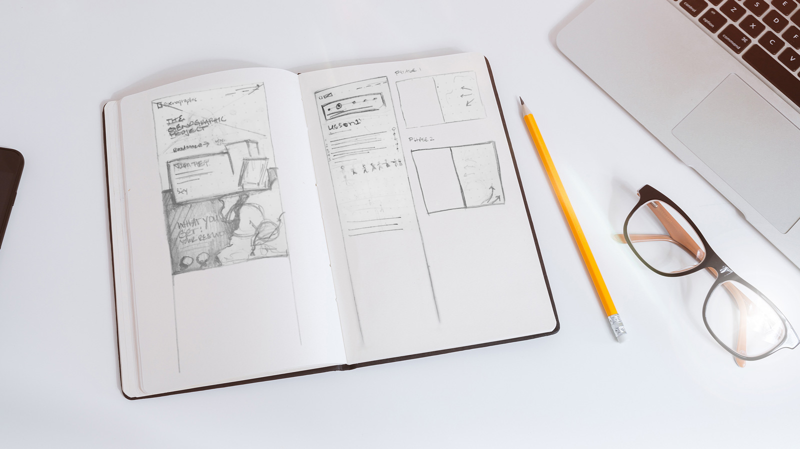
PHASE 1: DESIGN THINKING
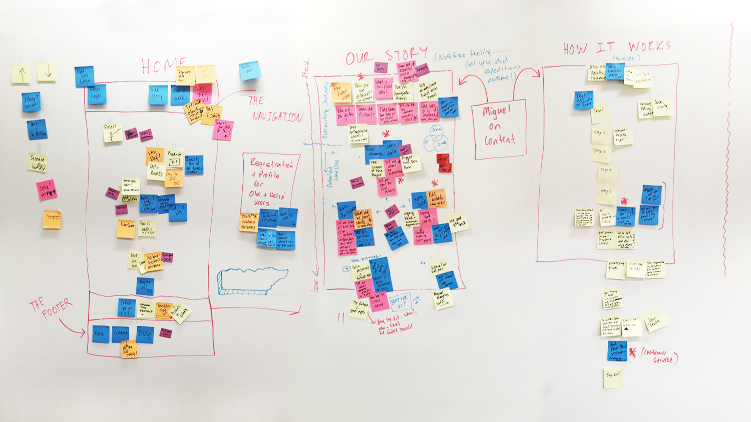
Our process began with several sessions where we considered existing project prompts and content. We used the design thinking methodology (displayed above) to rapidly establish content buckets, categorize our pages, develop a content flow, loosely wireframe, and create a very high-level prototype. We then tested our prototype by giving random people a prompt and watched as they walked themselves through the “site” to accomplish it. This approach gave us the validation we needed to make quick decisions and keep costs low.
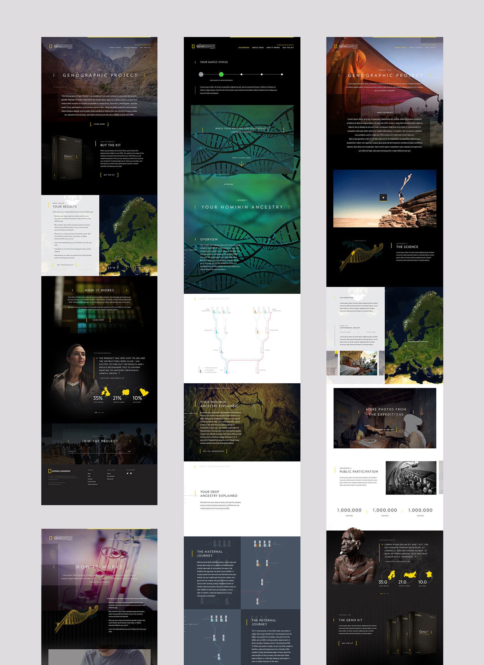
Ultimately, we broke down the original content and developed a new strategy to entice visitors to engage with the project. I recommended streamlining the flow by limiting public pages to Home, Our Story, and How it Works. After a participant buys/registers a kit and submits a sample, they must wait 6 weeks for their sample to be processed. To keep the participant engaged until their results are ready, the science behind the project would be released in the form of biweekly science lessons.
Phase 2: User WorkFlow and wireframing
Kicking-off the project with Design Thinking and rapid prototyping made finalizing wireframes and user workflows seamless. Users could easily navigate to any of the public facing pages, but were required to log-in to engage with the Science Behind the Kit, check their sample’s status, or view their results.
Phase 3: Visual Design
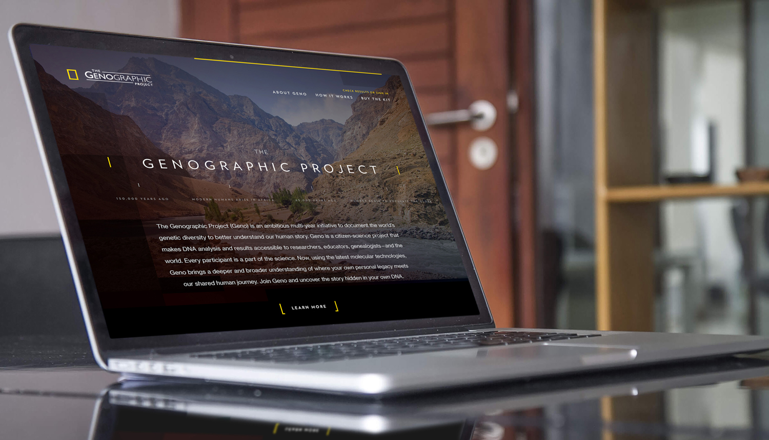
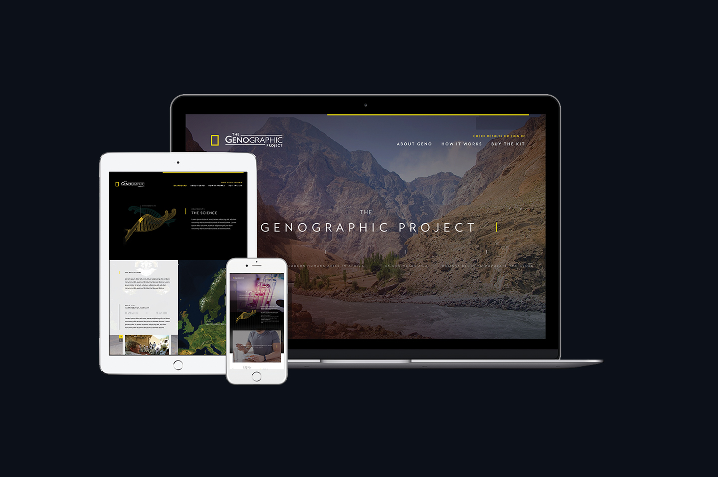
While respecting National Geographic’s newly established rebrand, I was still able to create a distinct Genographic look and feel. Participants in the project are embarking on an expedition with National Geographic to not only learn about the science behind DNA and ancient ancestry, but discover who they are and where they come from. My goal was to create an expansive visual experience that reflects the idea of diving into this adventure.
