.02
Tminus
Skills
- Branding
- Art Direction
- Visual Design
- UX & UI
Introduction
Tminus, Celerity’s sister brand, is a digital experience agency dedicated to developing top quality interactive solutions. As the project lead, I was given the task of fully designing an identity system for tminus including but not limited to persona, logo, collateral, brand guidelines, and website. My goal was to create a minimal, timeless system that allowed tminus’ projects, accomplishments, and people to shine through.
PHASE 1: RESEARCH & SKETCHING
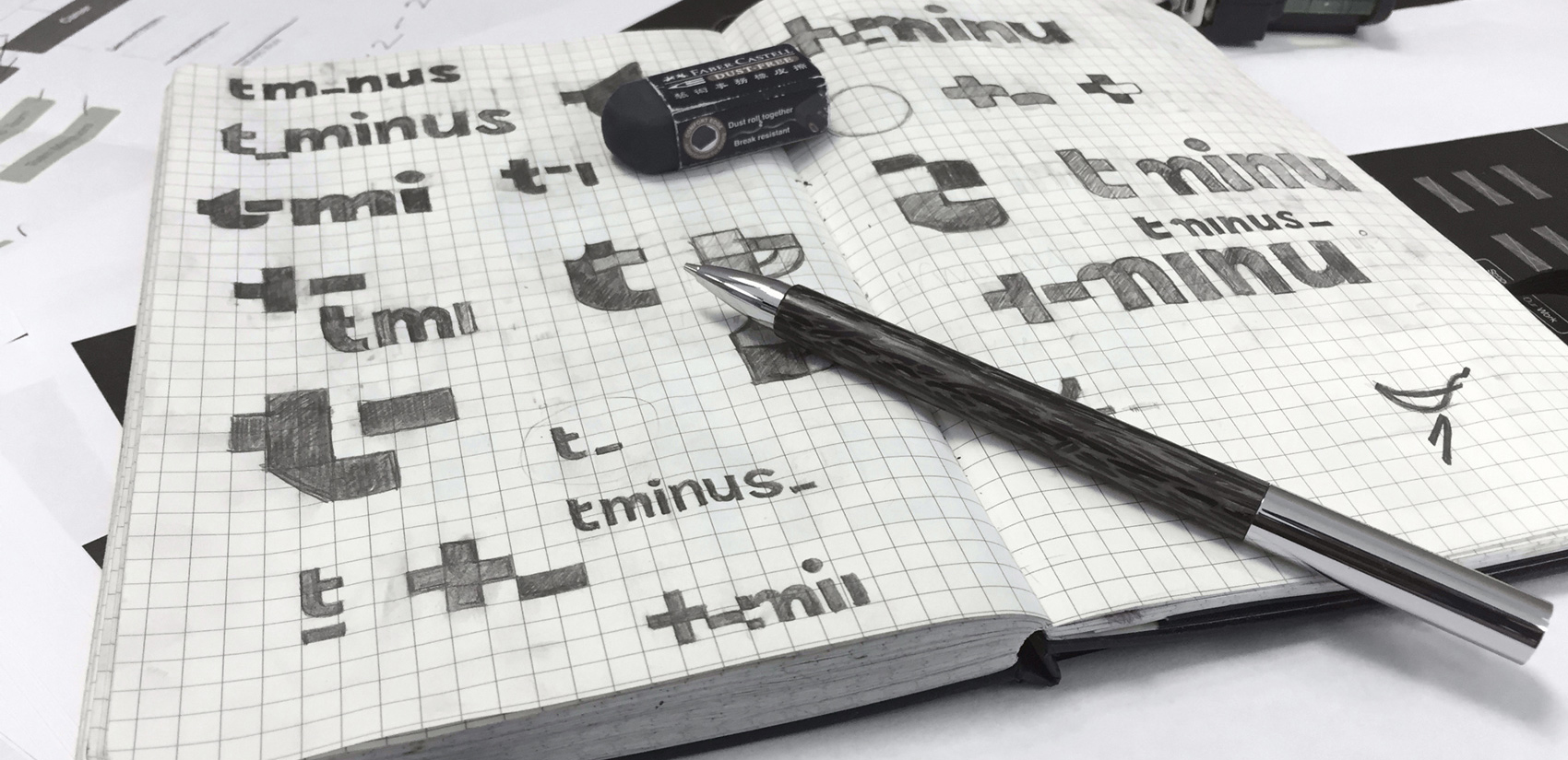
The design process began by conducting an analysis of Tminus’ competitors. My focus was creating a unique identity while considering what made the visual identity of Celerity's competitors work.
Once research was complete, I began the process of establishing personality traits for the brand. Tminus needed to be minimal, modern, unflappable, and allude to digital. These words plus a moodboard served as my compass as I moved into design and logo development.
PHASE 2: BRAND DEVELOPMENT
After sketching a series of different concepts, I began to develop a few in Illustrator. One concept stood out amongst the rest―-a customized wordmark based on the typeface Akkurat. Akkurat is a Swiss Typeface with a clean, minimal, and technical look; perfect for Tminus' voice and tone. When appropriate either the wordmark or logo can be used. In digital or social media implementations, the wordmark can animate and transition to the logo.
Brand guidelines provide color palette information and type usage rules and specifications.
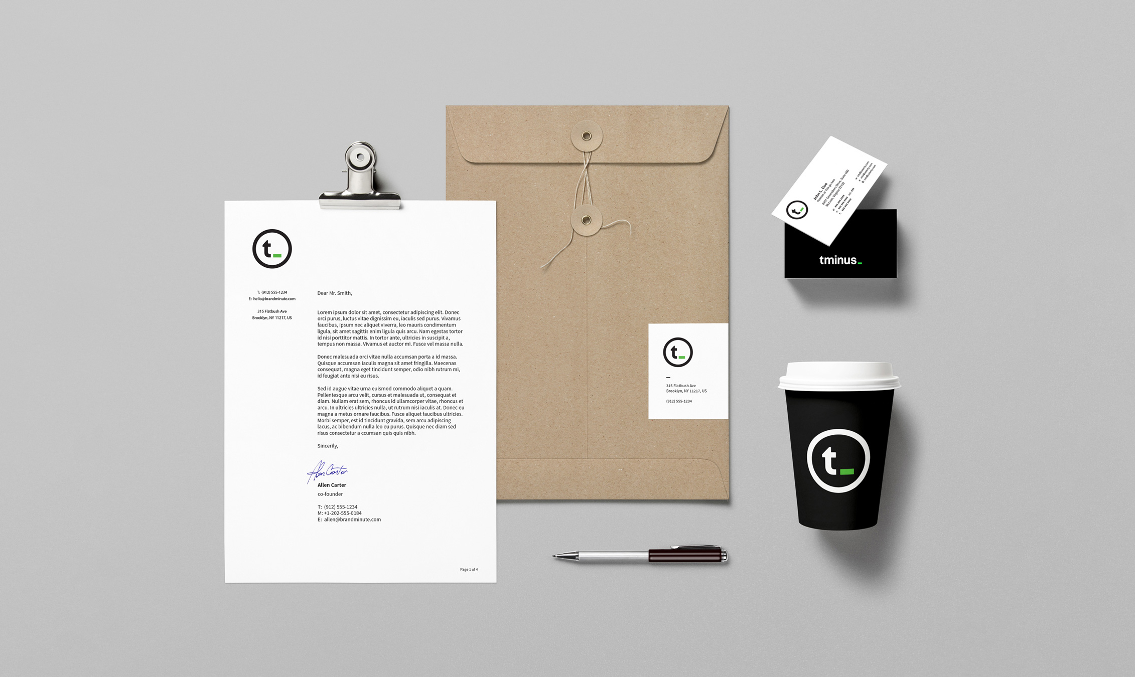
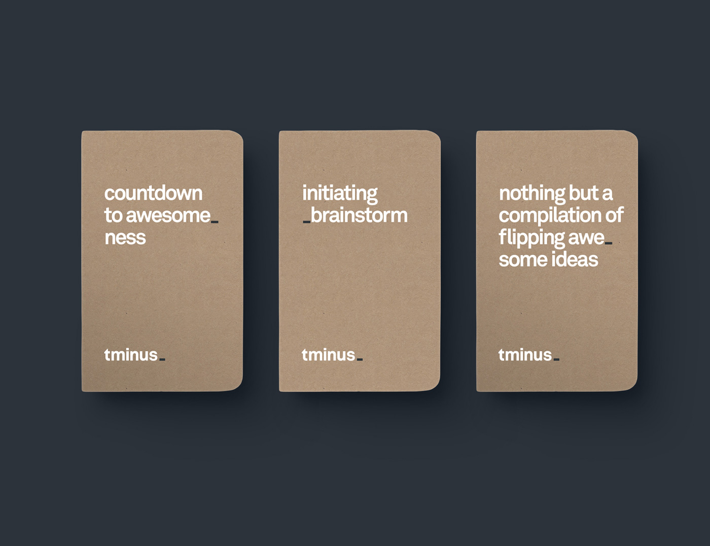
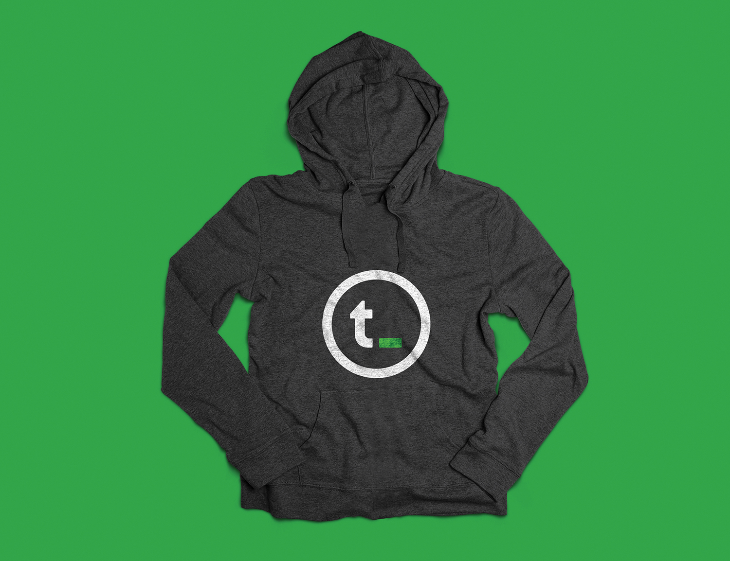
PHASE 3: Brand APPLICATION
Please see below for practical applications of Tminus' established brand standards.
PHASE 4: DIGITAL EXPERIENCE
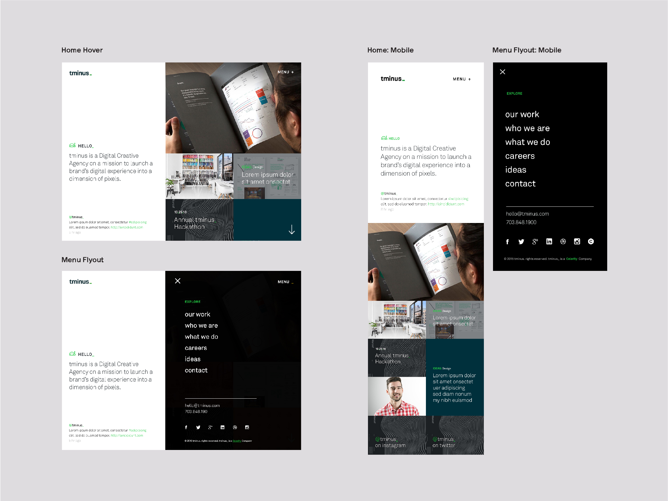
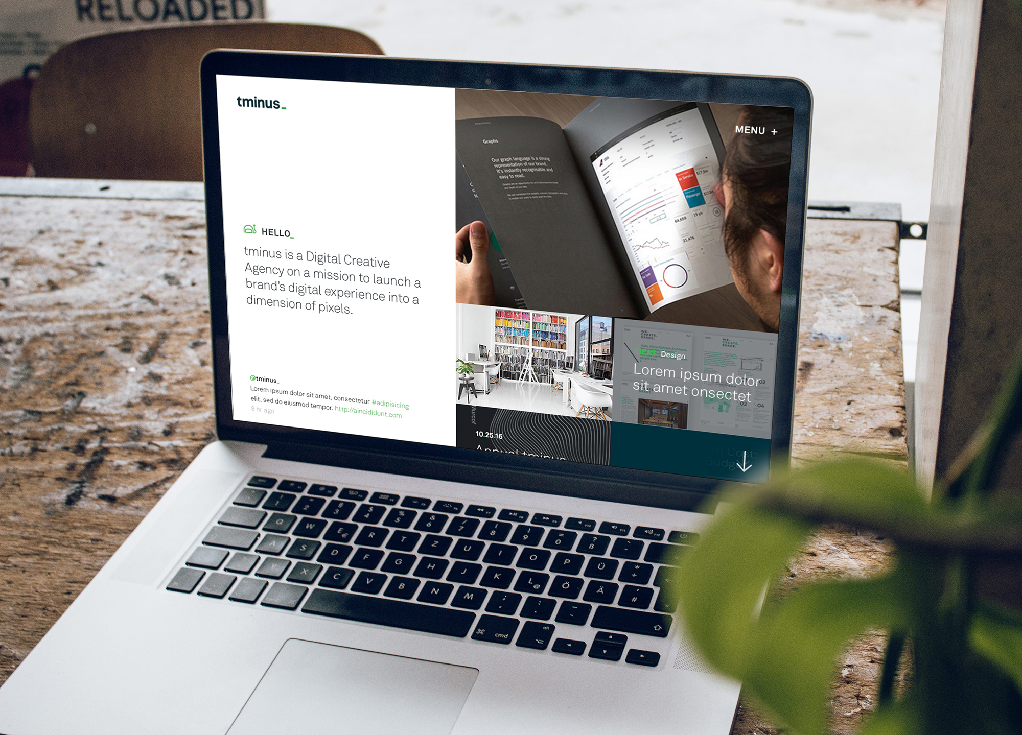
Upon finalizing Tminus's brand and brand standards, I began developing its website. As a digital agency, Tminus needed a website that met three primary objectives: 1. a clean and flexible interface perfect for showcasing Tminus case studies and work; 2. blogging capabilities which provide Tminus with the systems it needs to establish itself as a thought leader; 3. people first user experience establishing Tminus' culture.
This process began with creating a sitemap of all the site’s pages and content. Upon sitemap approval, I developed the user flow (how users navigate from page to page or accomplish tasks on the website), and then began wireframing. Wireframes are used to display a page’s content and functionality at a very high-level. High-fidelity comps of all the site’s pages followed approved wireframes. The Tminus website was designed mobile first. Prototypes were built out in InVision to help stakeholders visualize the final product before kicking-off development.
